The cost to print & install pole banners can be significant, and with a few tips, designing artwork that’s appropriate for pole banners can save much time and effort later.
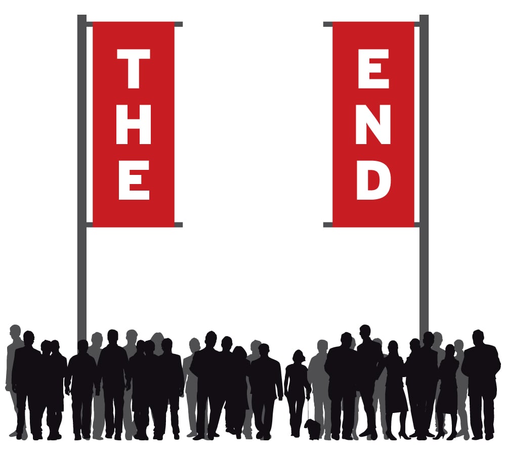
One of the keys to successful pole banners is simplicity, and another is the placement of the artwork on the banner itself.
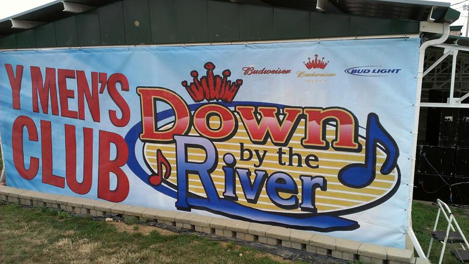
For example, we see a lot of artwork which runs right to the edge of the “live area”, the space which is viewable once a graphic has been printed and finished. If a pole banner is 48″ tall x 30″ wide, it would not be uncommon to see a graphic design which fills out those dimensions.
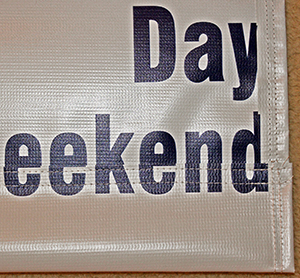
When designing artwork, we suggest keeping important graphic elements and copy a few inches from each edge of the live area. It’s all right to let the background run off the edges, but the rest of the text items in a design – a company name, title of an event, dates, phone numbers, websites – should be kept a few inches away from each edge. Failure to do so, could result in pole banners that look like this.

Many pole banners have a 3″ pocket at top and on the bottom (though this varies and can be anywhere from 1 – 4″ or larger). Our hem (or stitch line) on the pockets consumes another 1″ inch of material. So 4″ at top, and 4″ at bottom, must be allotted for the text to read without crossing into the pocket for a 3″ pocket.
The general rule of thumb is to add 1″ to the size of the pole pocket. If a 2″ pocket is all that’s needed, allow 3″ at top and 3″ at bottom and your finished design should be safe to print.
There’s no need to worry about stitching on the left and right sides, as we do not recommend side hems in our double-sided banners.
As long as all important items are kept within this area, you can feel confident that any wording and graphic elements will not have any sewn threads tracking through them, which can reduce their readability and effectiveness.

When we produce double-sided pole banners, some of the material from one side is folded over on top and bottom. Occasionally the folded material doesn’t align properly, and a fraction of an inch offset is all it takes to “break” letters and graphics.
Like all printed products, taking time at the beginning to create a good design & using proper proportions will ensure a beautiful product.

