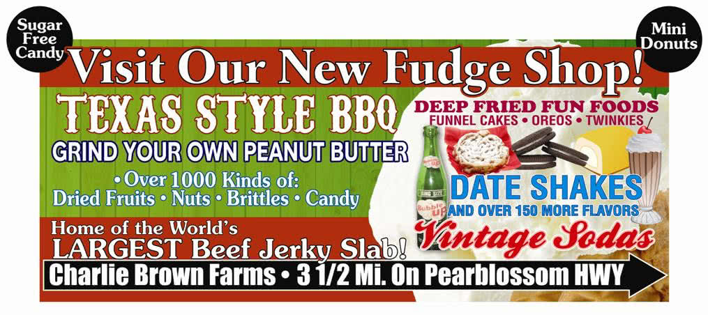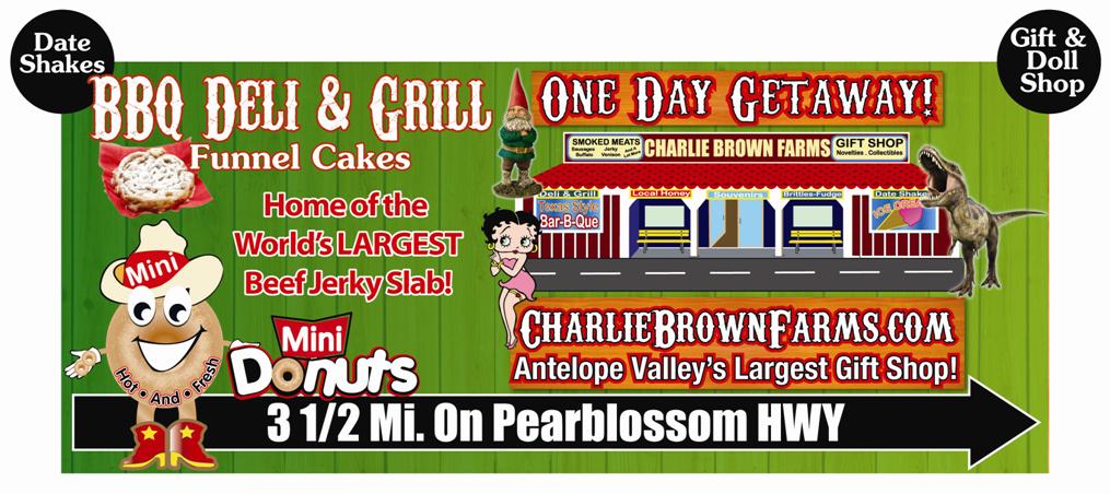

Here we have two billboard designs from an advertiser that is new to out of home advertising.
After a few minutes of reading and comparing the two designs, it’s revealed the advertiser is Charlie Brown Farms. These ads are the kind of seizure-inducing blasts of color and copy that usually repel potential customers before they can process any of the information wedged into these layouts. Honestly, even the Pink Floyd show I saw back in 1994 could not come close to giving me a headache like these two billboards are currently doing.
Details, you say? What specifically makes these two of the first billboards I’d jettison in the event of an outdoor advertising emergency?
These two billboards lack readability; they are very difficult to read, even while viewing them on a computer monitor. My eyes cannot stay on any one line of copy or graphical element without constantly being distracted by the items around it. Trying to read these is the visual equivalent of trying to put two magnets end to end as one pushes the other away. So the worst mistake is overcrowding. Billboards are not brochures, are not internet pages, are not flyers you hang in the hallway at work. You’ve got just a few seconds to get your message across, and the only message these boards are effectively relaying is confusion.
What’s with the Mickey Mouse ears on the top corners? These are like footnotes in War And Peace, and they are the first items I’d remove. They add nothing positive to the overall design.
Who is the advertiser? Texas Style BBQ? BBQ Deli & Grill? Mini Donuts? CharlieBrownFarms.com? Some random location with a new fudge shop? Would you be willing to pull the family off the interstate to see the “world’s largest beef jerky slab”? What is a “date shake”? It sounds almost criminal. One day getaway? How much of this copy makes any sense at all? Would the advertised items persuade you to visit Charlie Brown Farms?
One or two graphic elements and three lines of copy would be a nice contrast to the clutter of these designs. What is the most popular reason people visit? Or the second most? Advertising those aspects would be an effective way to advertise what Charlie Brown Farms has to offer.
Removing 90% of the current items in these two designs should allow viewers to read the name of the advertiser, their location, and a brief description of the variety at Charlie Brown Farms, in all of its funnel cake glory. And the mini donut character would make for a much more effective extension off the board than either date shakes or gift & doll shop.
Charlie Brown Farms looks like a great place to stop for a shake on I-95, and their outdoor advertising could better reflect that with a few changes.
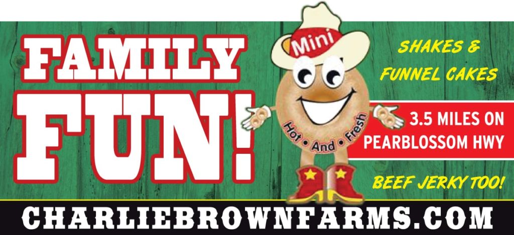
Below we have taken their design, and enhanced it to be more effective for use as a roadside billboard.

In summary, we’ve taken a kaleidoscope of items and given it focus. The words “Family Fun” and the Mini-Donut graphic are a big part of the essence of Charlie Brown Farms, and will be more effective than the roulette wheel of items in the original designs. We could have used an image of a large jerky stick or a large shake, and we chose the Mini-Donut to illustrate how to trim up the hedges blocking the house, metaphorically speaking, because it was already included in the original designs.
Future blog articles will be forthcoming, right after we break for funnel cakes and deep fried twinkies.
Michael Bailey – Graphic Designer
Independent’s Service Company
